Color matching is Soft decoration design and decoration Through the adjustment of hue, purity and hue, it affects the comfort of the room and expresses people's feelings. Next, we will introduce the color matching in indoor soft clothing.

1、 Understand the basic concept of color
The colors can be cold or warm, light or heavy, light or dark, far or near, colored or non colored. Among them, achromatism refers to black, white and gray.
Each color has three attributes: hue, lightness and purity.
Hue: It refers to the appearance of color and the name of color category. For example, black, white and red.
Brightness: refers to the brightness of the color. White has the highest lightness, while black has the opposite.
Purity: also called saturation, it refers to the purity of color. For example, the famous Morandi color is a color with low purity.
In the actual color matching process, if a color is constantly mixed with white, its brightness will increase and its purity will decrease. If it is mixed with black, its purity and brightness will decrease at the same time.
Cold and warm colors: In the color disk, the coldest color is blue, and the warmest color is orange. These two colors complement each other and are the poles of cold and warm colors. In terms of space, warm colors are forward colors, and cold colors are backward colors.

2、 Color matching rules
1. Golden ratio
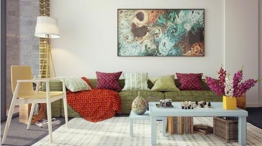
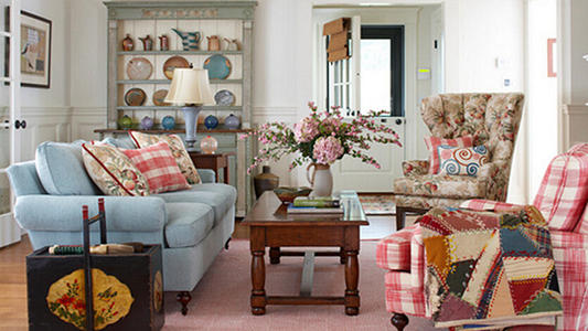
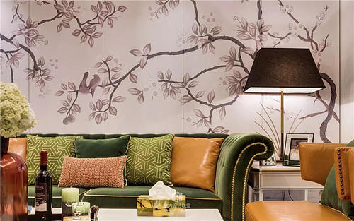
High end soft decoration Color matching can also refer to the golden ratio: there are no more than three kinds of room colors, and the proportion can be distributed according to the principle of 60:30:10. For example, the wall is 60%, furniture, bedding and curtains are 30%, and 10% is small jewelry and art.
2. Learn from nature
Nature is the greatest master of color matching. If we can't match colors ourselves, we can learn color matching from the colors of plants, oceans, mountains and animals.
3. Learn from national handicrafts
Ethnic minorities or some foreign handicrafts can be used for reference.
4. Learn from children's paintings
Children's art works are full of innocence. The choice of color is instinctive, but it can be matched naturally.

3、 Practical application
1. Choose different colors for different functional areas
Color matching can be carried out according to room functions. The restaurant can use warm colors to increase appetite and pleasure; The bedroom and study can use mustard yellow and brown, which represent the low color difference of autumn; The bathroom can be clean and clean without color or cold color.
2. Choose color according to space size
For small houses, it is better to choose simple and fresh colors. Strong colors can be used for individual embellishments, which will increase the overall vitality and interest.
Large size, warm color and dark color can be selected to reduce Overall household soft decoration The open feeling of medium and large space creates a warm and comfortable atmosphere. When matching, try to avoid letting the same color decorations scatter in every corner of the room, which will make the large space appear more diffuse and lack of center. Centralized display of similar color decorations will focus the indoor space.
From the perspective of vertical space, the ceiling to the ground should make the space look harmonious as a whole. The simplest way is to divide the weight of colors. Dark colors are the heaviest, and they are used at the lower part; Light color is the lightest, suitable for ceiling; Moderate colors can run through it.
If the ceiling is painted in dark color or the same color as the wall, the whole space will look smaller and warmer. On the contrary, light color can expand the space and make the ceiling look higher.
3. Application of decorative colors
Look for a more prominent color, even an embellishment color, and other colors revolve around this color. For example, the selected flowers are wine red, and curtains, paintings, ornaments, cloth arts, etc. are all in wine red color, which makes the whole space more harmonious.
